
Welcome to my blog on Using Color Theory in Photography Composition! If you want to take your photography to the next level and create compelling and visually stunning photographs, then understanding the basics of color theory is essential. In this blog, we will explore how you can use color contrast, harmony, and balance to add depth, interest, and emotion to your photos. Let’s dive in and explore the wonderful world of color theory in photography!
Table of Contents
- Understanding Color Theory
- Practical Tips for Using Color Theory in Photography Composition
- A How-To Guide: Using Color Theory in Photography Composition
- Frequently Asked Questions
- What is color theory?
- Why is color theory important in photography composition?
- What is color contrast in photography?
- How can I achieve color harmony in my photographs?
- What is color balance in photography composition?
- How can I use color theory to enhance storytelling in my photographs?
- Are there any tools available to help me understand color theory in photography?
- Wrap Up
Understanding Color Theory
Before we delve into using color theory in photography composition, let’s first understand the basics of color theory. Color theory is the study of colors and how they interact with each other. It involves understanding color relationships, such as color contrast, harmony, and balance, and how they can affect the visual impact of an image.
Color Contrast: Creating Visual Impact
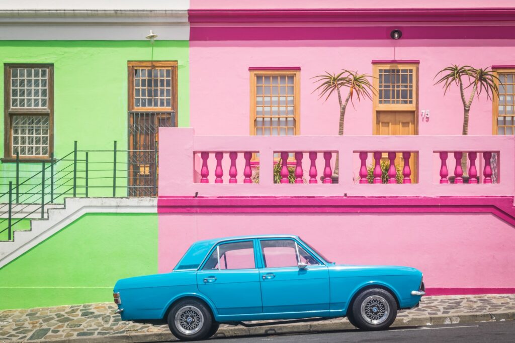
One of the most effective ways to make your photographs stand out is by utilizing color contrast. Color contrast creates visual interest and helps guide the viewer’s eye through the image. By combining colors that are opposite each other on the color wheel, such as blue and orange or green and red, you can create striking contrasts that immediately catch the viewer’s attention.
Color Harmony: Fostering Emotional Connections
Color harmony is all about selecting colors that work well together and create a sense of unity and balance in your photographs. Different color combinations can evoke different emotions and moods. For example, warm colors like red and yellow can create a sense of energy and excitement, while cool colors like blue and green can convey a feeling of calmness and serenity. By understanding color harmony, you can intentionally evoke specific emotional responses from your viewers.
Color Balance: Finding Equilibrium
Color balance refers to the distribution of colors in an image and how they interact to create a harmonious composition. Achieving balance in your photographs involves considering the placement and intensity of different colors. An image with too much of one color may feel overwhelming, while an image with an imbalance of colors may appear chaotic. Strive for a harmonious blend of colors that creates a sense of equilibrium and visual stability in your composition.
Practical Tips for Using Color Theory in Photography Composition
Choose a Dominant Color
One effective way to incorporate color theory into your photography is by selecting a dominant color that will anchor your composition. This dominant color will set the mood and tone of your image and serve as a focal point for the viewer’s eye. Whether it’s a vibrant red flower in a sea of green or a lone blue umbrella on a crowded beach, using a dominant color adds impact and visual interest to your photographs.
Use Color to Convey Emotion
Remember that different colors can evoke different emotions and moods. Leverage this knowledge to infuse your photographs with the intended atmosphere. For example, if you want to convey a serene and peaceful scene, incorporate cool and calming colors like blues and greens. On the other hand, if you want to create a sense of excitement and energy, incorporate warm and vibrant colors like reds and yellows. Your color choices can transform an ordinary scene into one that is emotionally impactful.
Experiment with Color Combinations
Don’t be afraid to experiment with different color combinations in your photography. Some colors naturally harmonize with each other, creating a visually pleasing image. Others may offer unexpected and striking contrasts that demand attention. By exploring various color combinations, you can discover exciting new ways to elevate your compositions and create unique visual stories.
Pay Attention to Light and Shadows
Light and shadows play a crucial role in color perception. The quality and direction of light can alter the appearance of colors, creating interesting textures and depth. Experiment with different lighting conditions, such as soft diffused light or dramatic golden hour light, to see how they interact with the colors in your scene. Additionally, observe how shadows can create contrast and add depth to your photographs.
Did you know that humans can perceive millions of different colors? It's all thanks to the specialized cells in our eyes called cones, which allow us to see a vast spectrum of colors and appreciate the beauty of the world around us!
Color theory is a powerful tool that can elevate your photography compositions to new heights. Understanding how color contrast, harmony, and balance work together can help you create visually captivating images that engage your viewers on a deeper level. So, the next time you pick up your camera, remember to consider the colors in your frame and use them to your advantage. With practice and experimentation, you’ll master the art of using color theory in photography to tell compelling visual stories!
A How-To Guide: Using Color Theory in Photography Composition
When it comes to photography, color plays a vital role in capturing captivating images. Understanding color theory and incorporating it into your composition can elevate your photographs from ordinary to extraordinary. In this guide, we will explore the basics of color theory and how to use color contrast, harmony, and balance to create compelling photographs that grab the viewer’s attention.
1. Understanding Color Contrast
Color contrast refers to the difference between colors in an image. By utilizing contrasting colors, you can create visual interest and make elements stand out. The following techniques can help you leverage color contrast:
- Complementary Colors: Pairing colors that are opposite each other on the color wheel, such as blue and orange, or red and green, creates a strong contrast.
- Using Neutrals: Incorporating neutral colors, like black, white, or gray, alongside vibrant hues creates a stark contrast that draws attention to your subject.
- Color Blocking: Experiment with separating different colors in your composition to create bold and striking contrasts.
2. Creating Color Harmony
Color harmony is essential in creating a pleasing and unified composition. To achieve color harmony, consider the following techniques:
- Analogous Colors: Choose colors that are adjacent to each other on the color wheel, such as red and orange or blue and green. These colors naturally blend together and create a sense of harmony.
- Triadic Colors: Select three colors that are evenly spaced around the color wheel, like red, yellow, and blue. This combination offers a balanced and dynamic harmony.
- Tonal Harmony: Ensure that the tones or shades of the colors in your composition are consistent. This creates a cohesive and harmonious look.
3. Achieving Color Balance
Color balance refers to the even distribution of colors in your photograph. It helps establish visual stability and draws the viewer’s eyes across the image. Here’s how you can achieve color balance:
- Consider the Rule of Thirds: Place the colors in your composition according to the rule of thirds, which involves dividing the frame into thirds both horizontally and vertically. This technique creates a balanced and visually appealing image.
- Use Color Dominance: Select one dominant color and complement it with subordinate colors. This creates a focal point and adds a sense of balance to the overall composition.
- Experiment with Color Temperature: Balance warm and cool colors to create a visually pleasing equilibrium.
By grasping the basics of color theory and applying these techniques, you can create captivating photographs that engage your audience and tell compelling visual stories. Start experimenting with color contrast, harmony, and balance in your compositions, and watch your photography skills soar!
Frequently Asked Questions
What is color theory?
Color theory is a field of study that explores how colors interact with each other and how they can be used to evoke emotions and create visual impact.
Why is color theory important in photography composition?
Color theory is important in photography composition because it helps to create visually appealing and harmonious images. By understanding how colors work together, photographers can effectively use color contrast, harmony, and balance to create compelling photographs.
What is color contrast in photography?
Color contrast in photography refers to the differences or variations in color intensity, temperature, or hue. By incorporating contrasting colors in your composition, you can create images that grab the viewer’s attention and add visual interest.
How can I achieve color harmony in my photographs?
To achieve color harmony in your photographs, you can use complementary colors (colors that are opposite each other on the color wheel), analogous colors (colors that are adjacent to each other on the color wheel), or a monochromatic color scheme (using variations of a single color).
What is color balance in photography composition?
Color balance refers to the distribution of colors in a photograph. It ensures that the colors look natural and harmonious. Proper color balance can be achieved through post-processing techniques or by adjusting white balance settings during the capture process.
How can I use color theory to enhance storytelling in my photographs?
Colors have the power to evoke specific emotions and convey certain messages. By understanding how colors are perceived and associated with different moods or themes, you can strategically incorporate colors in your photographs to enhance the storytelling aspect and create a stronger visual impact.
Are there any tools available to help me understand color theory in photography?
Yes, there are several tools available online that can assist you in understanding and applying color theory in photography. Color wheels, color palettes, and color harmony generators can be valuable resources to help you create visually appealing compositions.
Wrap Up
In conclusion, understanding color theory is crucial for photographers looking to create captivating compositions. By employing techniques like color contrast, harmony, and balance, you can elevate your photography to new heights. Remember to utilize complementary or analogous colors to create visual impact, and experiment with color temperature to set the mood of your photographs.
Now it’s your turn! Have you tried using color theory in your photography? What results did you achieve? Leave a comment below and share your experiences. We’d love to hear from you!